How to Design Engraved Tags for Maximum Readability and Clarity
April 9, 2026
A good engraved tag should be easy to read quickly. If users need to stop, lean in or guess what a tag says, the design is not working as well as it should.
Engraved tags are used daily across lockers, keys, cupboards, cabinets, doors, storage bays and equipment. Clear design improves organisation and reduces confusion.
Why readability matters
Tags need to communicate information clearly and quickly.
- faster identification
- reduced errors
- less confusion
- more professional appearance
Start with the purpose of the tag
The design should reflect how the tag will be used.
- locker numbers
- key tags
- cupboard labels
- room nameplates
- equipment tags
Keep wording short
Less text improves readability and allows for larger lettering.
- use numbers or short codes
- avoid long descriptions
- focus on essential information
Prioritise key information
The most important detail should stand out first.
- large locker numbers
- clear room names
- prominent asset codes
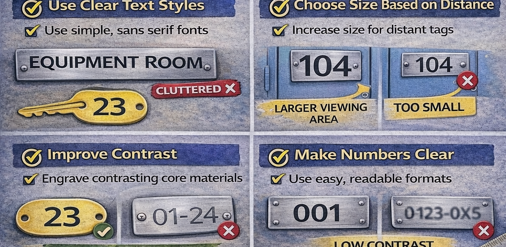
Choose size based on distance
Text size should match viewing distance.
- small for close-up use
- large for distance viewing
- increase plate size where needed
Use clear text styles
Simple lettering improves clarity.
- clean and simple fonts
- even spacing
- consistent style
Avoid overcrowding
Too much content makes tags harder to read.
- limit text lines
- use spacing effectively
- avoid cluttered layouts
Use proper margins
Leave space around text for better balance and readability.
Improve contrast
Strong contrast helps text stand out.
- dark text on light background
- engraved contrasting core materials
- clear visibility in different lighting
Make numbers easy to distinguish
Number clarity is essential for identification systems.
- use clear numbering formats
- avoid cramped layouts
- maintain consistency
Consider text case
Choose upper or mixed case based on readability.
- capitals for short codes
- title case for names
- avoid long all-cap text blocks
Keep formatting consistent
Consistency improves recognition across a site.
- same font and layout
- consistent numbering
- uniform sizes and spacing
Match layout to application
Different uses require different design priorities.
- large numbers for lockers
- compact codes for keys
- clear titles for cupboards
- visible signage for rooms
Consider the environment
Lighting, placement and usage affect readability.
- indoor vs industrial settings
- lighting conditions
- viewing angles
Test before production
Review wording and layout to catch issues early.
- check clarity
- confirm consistency
- verify readability
Common mistakes to avoid
- too much text
- small tag sizes
- low contrast
- inconsistent formatting
- crowded layouts
Simple design works best
Clear, simple layouts deliver the strongest results for engraved tags.
Better readability improves identification
Well-designed tags make it easier to find lockers, match keys and organise storage across a workplace.
A focus on readability leads to better long-term performance and usability.
Discover more from Blog Total Locker Service
Subscribe to get the latest posts sent to your email.